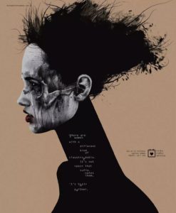
Nowadays, there are many ways to transmit information, and the most important way is advertising. Because the message is more direct through advertising. In March 1, 2016 the MinhaMelhorSemana published an advertising named “ Claustrophobia”, which made by Johnny Cardoso. This is a public service announcement, the focus here is on the violence against women.
The AD shows a woman’s profile, with black paint showing cuts and deep-set eyes on her face. This depicts the long-term violent treatment of women in the home. Looking at the picture as a whole, the author largely USES black as the tone of the advertisement, giving people a very dull visual feeling. The woman had a word written around her neck “ There are women with a different kind of claustrophobia. It’s no space that suffocates them. It’s their partner”. This explains the meaning of advertising from a side perspective. Although the time and place of the advertisement is not clear, people are clearly aware of the central idea of the advertisement, which can be judged by the words and the wounds and sad expressions on the women’s faces. The advertisement is vague and abstract, and it can be understood through the expression and color of a woman.
This image shows that there are still a lot of women in the world who suffer from violence because their partners are violent. The AD is an appeal for women not to suffer more violence. To draw attention to women’s mental health. Because women are also under great pressure, they not only have to take care of the children and do the housework every day, they also have to care for their husbands. The overall tone of the AD is dark, like the inner workings of a woman who has been subjected to violence. No embellishments of bright colors. The effect of this is that people feel more strongly about the psychology of the female victims. The close combination of text and color is a better way to help people realize the problems that this problem brings to women.
This image effectively communicates the target to everyone. The AD uses a poetic black satire. Such tactics will make it easier for people to feel the difficulty of women. This approach is also a direct expression of the problems women face in today’s society, when they face violence from their partners, which is a serious problem and should be addressed immediately.
The AD appeared in a city in Brazil, on a mall in a central city, with a huge LED screen displaying the image. The advertisement also attracted people’s attention because of its color and the content of the picture, which aroused people’s thinking about the violence surrounding women. More people will wonder why women are new, and then start to reflect on men’s own behavior.
Most people recognize the company’s brand. Although it is a pharmaceutical company, it has been able to focus boldly on protecting women. And the company’s customers all spoke positively about it. “The brand has a good focus on women’s mental health,” one customer said. This shows that when you’re creating a product, not only is quality the most important thing, but you have to learn how to connect with current events, how to connect with life. Practicality is an indispensable factor on the one hand, then the object of promotion, and the crowd of promotion is very important. Therefore, the brand side will also adjust its product parameters according to the needs of the crowd.
Reference
https://www.adsoftheworld.com/campaign/minha-melhor-semana-bolero-03-2016
https://www.trendhunter.com/trends/violence-against-women-campaign
http://www.adeevee.com/2016/03/minhamelhorsemana-violence-against-women-outdoor-print/